
App Redesign and Design Library Creation
1 Second Everyday, 2020
Intro
Implementing a Much-Needed Early Design System
I joined 1 Second Everyday as their first full-time designer, stepping into a role that came with the opportunity to shape the app’s visual identity. At that time, the app had been operational for several years, and a part-time contractor had previously provided visual design support as needed. However, there were no established component libraries, design systems, or branding guidelines.
My initial project involved assessing the existing design framework within the app. I discovered a wide array of color variations and styles, reflecting the ad hoc nature of the early startup phase. Unfortunately, this lack of cohesion resulted in inconsistencies, insufficient accessibility, and a disconnect from our user base.

My Role
Creator of Unimorphic Design Library
During my first two years at 1 Second Everyday, I focused intensively on enhancing the user experience and developing major features within the app. By the summer of 2020, our team was ready to revisit the app’s visual design. To lead the comprehensive reskinning of the app, I took the following steps:
Workshop Facilitation: I organized a collaborative workshop with leadership, marketing, and design teams to establish a new visual direction for 1 Second Everyday.
High-Fidelity Mockups: Based on the insights gained from the workshop, I created high-fidelity mockups for key screens in the app.
Atomic Design Component Library: Once the mockups were finalized and approved, I developed a detailed “atomic design” component library to ensure consistency and scalability.
Design System Implementation: I then implemented the new design system across all existing screens in the app.
Ideation
Identifying a New Visual Direction
Although our product team was predominantly male, over 85% of our users identified as female, resulting in an app design that did not align with our user base’s preferences.
To address this, I began by researching popular UI trends and organizing my findings in a Miro board. I invited leadership and marketing to contribute their insights as well. Together, we discussed which styles resonated with our brand and product, highlighting the reasons behind our choices. We used stickers to mark the styles we believed were best suited for our users based on feedback gathered from user interviews.
From this collaborative effort, I selected the designs that received the most stickers and created mockups of key screens in those styles. We engaged in further discussions and voting until we ultimately settled on neumorphism. While this trending UI aesthetic was appealing, we felt it suited our product due to the physical nature of video cameras and journaling that we aimed to modernize within our app. However, I believed it was essential to adapt neumorphism to create our unique interpretation—one that was softer and less literal. The result was Unimorphism, 1 Second Everyday’s distinctive design style.

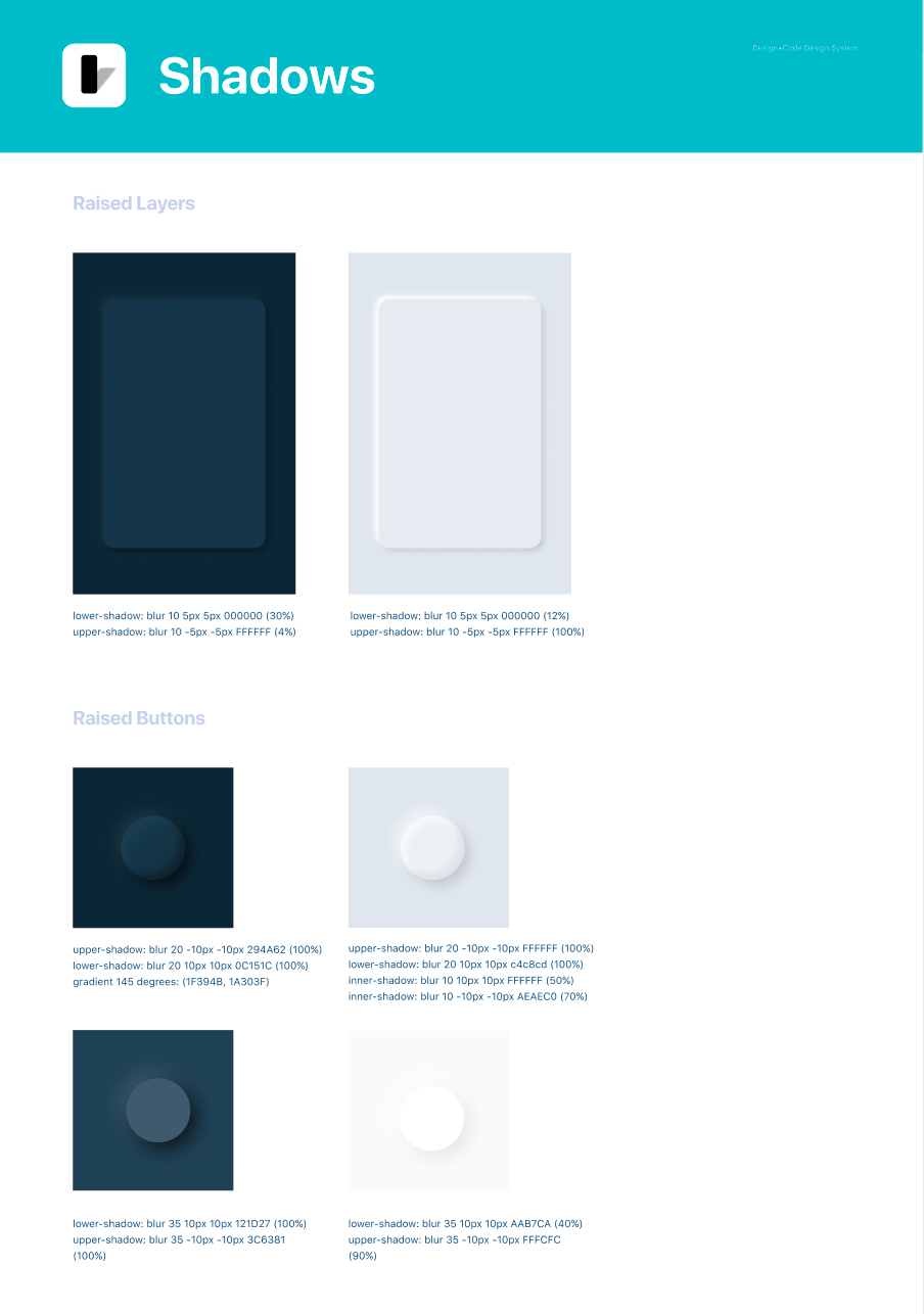
Designing in Three Dimensions
One of the challenges in developing a neumorphic component library was effectively managing drop shadows and highlights. Achieving a sense of realism while accurately representing depth within the app required careful mathematical calculations and thoughtful design considerations. To determine the appropriate drop shadow for each screen, I modeled the elements from a side view, ensuring that no objects visually overlapped or “ran into each other.”

Results
Improved Accessibility, Consistency, and Alignment with Users
By addressing accessibility issues related to contrast, font size, and weight, we drastically improved the legibility of our app. Although there was still more work to be done regarding dynamic type, localization, and other accessibility tools offered by Apple, we made significant progress from where our app had started.
I consolidated our color palette and font styles to less than half of what our old style guide included. We adopted an icon library with consistent weights and implemented both light and dark modes.
Our component library grew and evolved as we developed new features, continually improving along the way!
